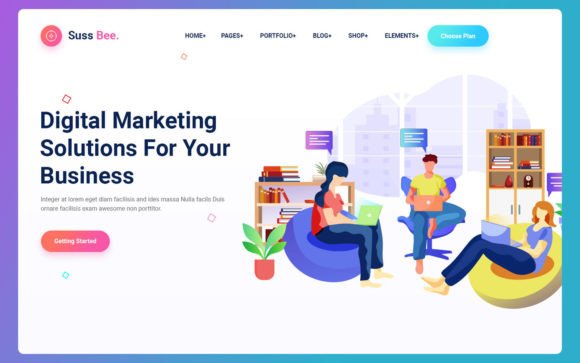
Building a Modern Web Presence: Why Suss Bee Is the Ideal Choice for Responsive Design
In the rapidly evolving landscape of web development, the first impression is often the only impression. Whether you are launching a new product, promoting an upcoming event, or showcasing a professional service, the visual appeal and functional reliability of your website determine your success. This is where Suss Bee emerges as a powerful solution. Designed with a modern, mobile-first approach, Suss Bee is a clean template that prioritizes both aesthetic design and simplicity of use. For developers, designers, and business owners alike, understanding the value of such a tool is essential for creating digital experiences that resonate with today’s diverse audience.
The Importance of a Mobile-First Approach
For years, web design was primarily focused on desktop computers. However, the proliferation of smartphones and tablets has fundamentally shifted how users interact with the internet. Today, more than half of global web traffic comes from mobile devices. A mobile-first approach means designing the user experience for smaller screens first, then scaling up to larger displays. This ensures that the core content and functionality are accessible and intuitive for the majority of users, regardless of their device.
Suss Bee embodies this philosophy. By starting with a mobile-centric foundation, the template guarantees that your website loads quickly, navigates easily, and looks polished on phones. This is not just a technical preference; it is a business necessity. Search engines like Google prioritize mobile-friendly sites in their rankings, meaning that a responsive design directly impacts your visibility and organic traffic. When you choose a template like Suss Bee, you are inherently aligning your project with current best practices in search engine optimization (SEO) and user experience (UX).
Full Responsiveness Across All Devices
One of the standout features of Suss Bee is its fully responsive nature. Responsiveness refers to a website’s ability to adjust its layout and elements dynamically based on the screen size and orientation of the device being used. Whether a visitor is using a large 4K monitor, a standard laptop, a tablet, or a compact smartphone, Suss Bee ensures that the content remains readable and the navigation remains functional.
This compatibility extends beyond just screen sizes. The template is tested and optimized for all major browsers, including Chrome, Firefox, Safari, and Edge. This cross-browser compatibility is crucial because users have different preferences and hardware capabilities. A site that breaks or looks distorted in a specific browser can lead to high bounce rates and lost conversions. With Suss Bee, you can rest assured that your digital presence is robust and consistent, providing a seamless experience for every visitor.
Simplicity and Design: Less Is More
In an era of information overload, clarity is king. Suss Bee focuses on design simplicity, stripping away unnecessary clutter to highlight what truly matters: your content. A clean template allows your images, text, and calls-to-action to stand out without competing against overly complex graphical elements. This minimalist approach not only looks professional but also improves load times, which is another critical factor for user retention and SEO performance.
The simplicity of Suss Bee does not mean a lack of features. Instead, it means that every feature is purposeful and easy to use. For beginners, this reduces the learning curve significantly. You do not need to be a coding expert to customize the template and make it your own. For experienced developers, the clean codebase provides a solid foundation that can be extended and modified without hassle. This balance makes Suss Bee an versatile tool for a wide range of users, from solo entrepreneurs to large agencies.
Practical Applications: Who Should Use Suss Bee?
While Suss Bee is flexible enough for various projects, it is particularly well-suited for specific types of websites where impact and clarity are paramount. Let’s explore some of the most common use cases:
- Event Landing Pages: If you are organizing a conference, workshop, or concert, you need a page that communicates key details—date, time, location, and registration—quickly and clearly. Suss Bee’s structured layout helps guide visitors toward signing up without distraction.
- Product Launches: When introducing a new product, you want to highlight its features and benefits with high-quality images and concise descriptions. The template’s focus on visual hierarchy ensures that your product shines.
- Service Selling Websites: Consultants, freelancers, and agencies can use Suss Bee to showcase their offerings, testimonials, and contact information in a professional manner. The clean design builds trust and credibility.
- Special Promotional Pages: For limited-time offers or seasonal campaigns, a dedicated landing page built with Suss Bee can drive conversions by focusing the user’s attention on a single goal.
By tailoring the template to these specific needs, you can create highly effective pages that serve their intended purpose without the bloat of a full-scale corporate website.
Enhancing User Experience Through Structure
A well-structured website guides the user journey. Suss Bee facilitates this through logical sectioning and intuitive navigation. When users land on your page, they should immediately understand what you offer and what action they should take next. This is often referred to as a clear call-to-action (CTA). Whether it is "Buy Now," "Register Here," or "Contact Us," the design of Suss Bee ensures that these buttons are prominent and accessible.
Moreover, the template supports various content formats, including text, images, videos, and forms. This versatility allows you to tell your story in a engaging way. For example, an event page might include a video teaser, a schedule timeline, and a registration form, all integrated seamlessly into the same cohesive design. This integration reduces friction and keeps users engaged throughout their visit.
Common Misunderstandings About Web Templates
There is a common misconception that using a pre-designed template limits creativity or results in a generic-looking website. However, this view overlooks the potential for customization. Suss Bee provides a solid structural framework, but it is entirely customizable. You can change colors, fonts, images, and layout arrangements to match your brand identity. The template serves as a starting point, saving you hundreds of hours of development time, which you can then invest in refining your content and strategy.
Another misunderstanding is that responsive design is too complex for non-technical users. With modern tools and templates like Suss Bee, this is no longer the case. The heavy lifting of media queries and flexible grids is already handled by the template’s code. Your job is simply to populate it with your unique content. This democratization of web design empowers more people to create professional-quality websites without needing extensive technical knowledge.
Conclusion: Investing in Quality Design
In conclusion, Suss Bee represents a smart investment for anyone looking to establish a strong online presence. Its mobile-first design, full responsiveness, and clean aesthetic align perfectly with modern web standards and user expectations. By choosing a template that prioritizes simplicity and compatibility, you ensure that your website is accessible, fast, and visually appealing across all devices and browsers.
Whether you are launching a new product, promoting an event, or selling services, the foundation of your digital strategy should be built on reliability and clarity. Suss Bee provides exactly that. It allows you to focus on what matters most—your message and your audience—while handling the technical complexities of web design behind the scenes. As the digital landscape continues to evolve, having a flexible, responsive, and user-friendly website is not just an advantage; it is a requirement. Start building your next project with Suss Bee and experience the difference that thoughtful design can make.
For more information on how to get started with Suss Bee, explore the documentation and demo pages available online. Taking the time to understand the tools at your disposal is the first step toward creating a website that truly connects with your audience.